Project Brief
UbicMedia was a company built around the groundbreaking technology created by a group of French scientists around secure file distribution. Their first public product utilizing the technology was PUMit, a platform for filmmakers to easily and securely, share and monetize their content. I worked with Ubic through various phases and contexts – the final result was a creating the consumer facing marketing site as well as the application back end and 3rd party integrations.
Intended Audience
PUMit was aimed at two markets:
- Independent content creators
Primarily independent feature length filmmakers, but anyone that had created a piece of filmed entertainment that they wanted to sell access to. These were content creators who were not drawn into social sharing as a business model unto itself. - Content distributors
For distributors of all sizes PUMit offered a secure platform that could be used to send out secure screeners to potential customers, as well as to have complete control over the digital distribution of a piece without relying on existing stores (iTunes, Amazon).
There was a continual battle between the scientific/academic and business people within the company as to whether to create a single application that addressed the needs of both, or two separate applications. I advocated for a single application (as the functionality was very similar in either case) and eventually this became the path that Ubic decided to follow.
Key Issue
The primary issue that Ubic and PUMit were struggling with was the product that was being developed as they were marketing it, and a continually shifting set of business goals that resulted in opportunities for both new and existing users to be thrown off.
My Approach
I objected to the insistence by the scientific branch of Ubic that users would need to be walked through the technical specifications behind the technology to become customers. I felt that getting the user to use the technology and test it on their own terms would be the most important step – if it worked most users would not care about the why.
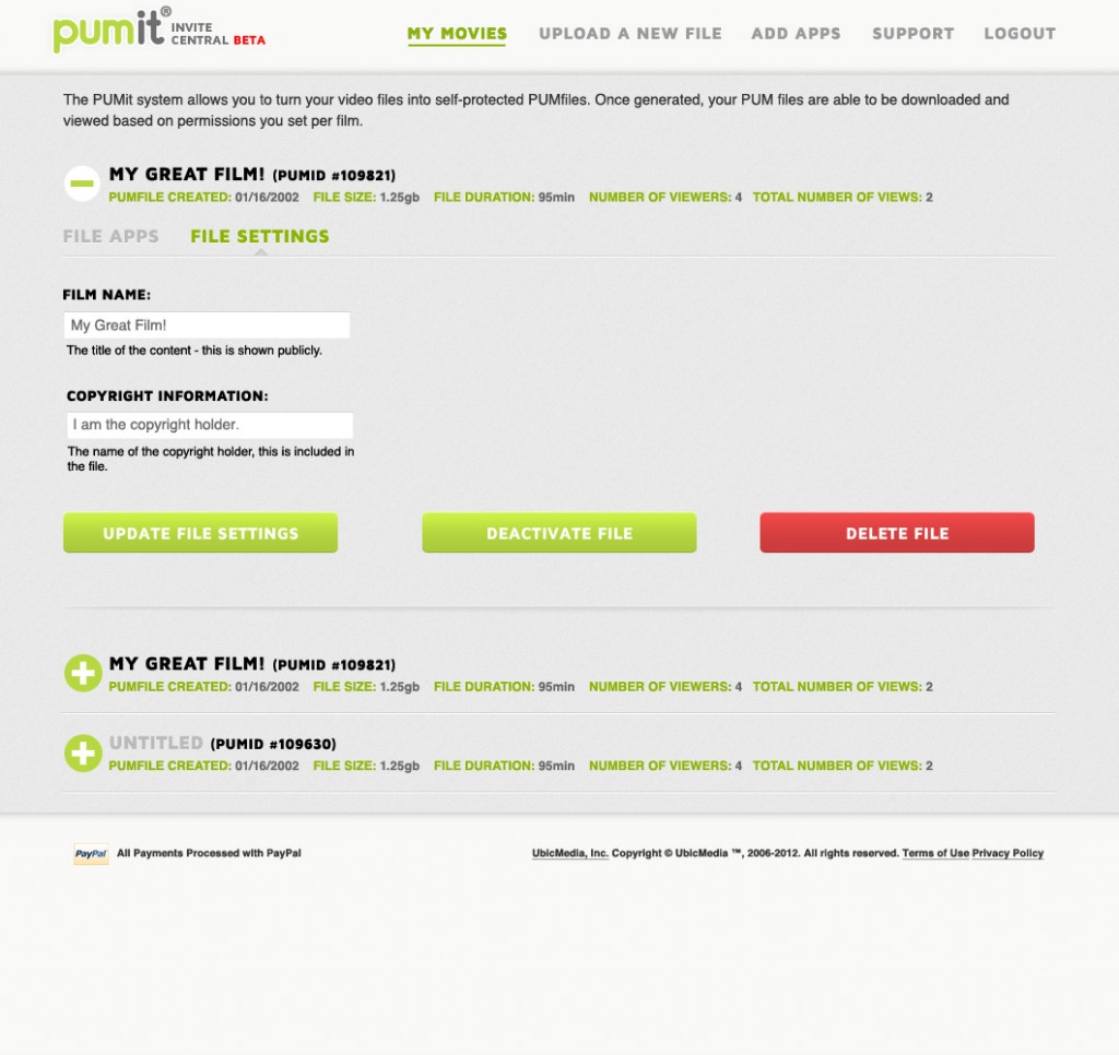
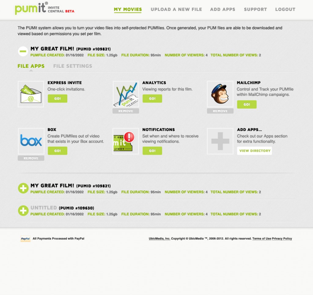
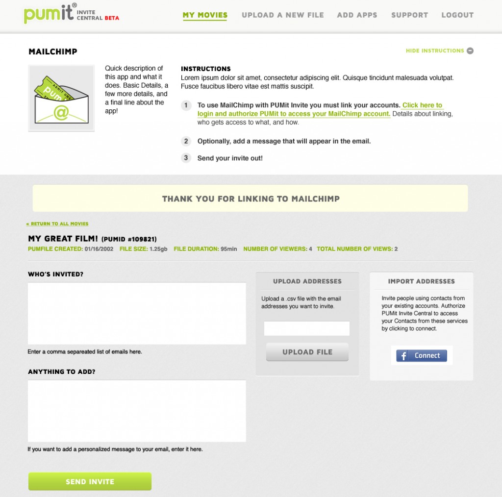
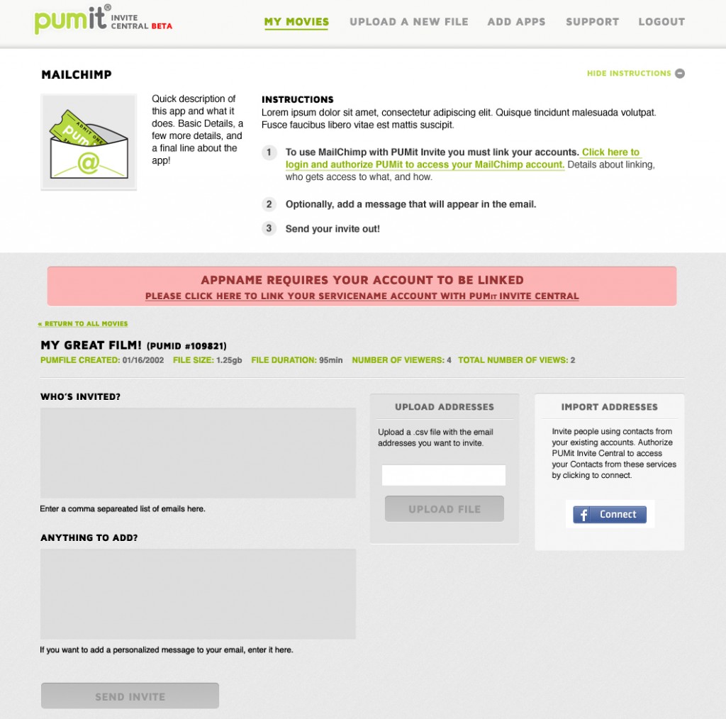
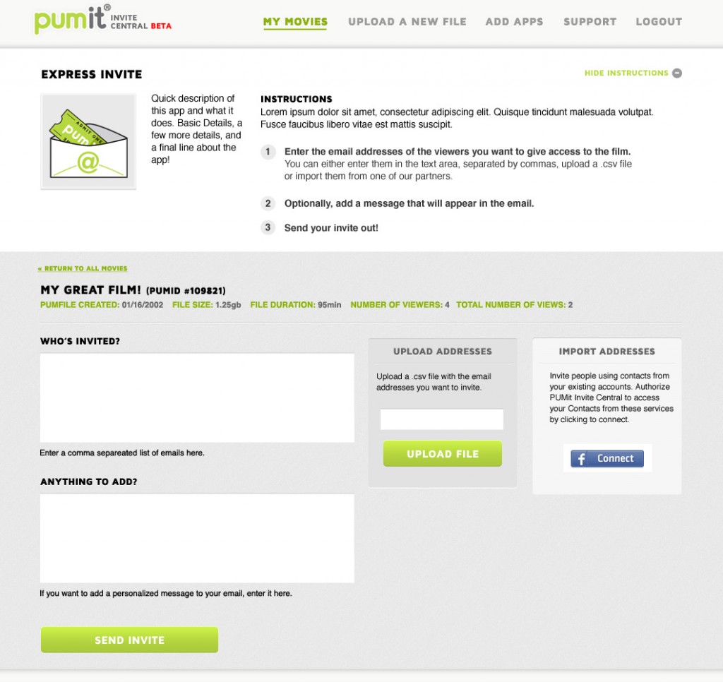
With that in mind we worked to create a simple and direct application interface that would allow users to quickly add files, customize the actions available for each file and have a simple direct dashboard to assess their overall content library. The business model behind PUMit was in flux, as were the methods available for 3rd party integrations. For this reason I emphasized the importance of a consistent messaging area, and styling. These were presented via inline dialog messages, and consistent application wide button states.
I initially tried to approach the PUMit site as I would a standard web application, but as it became clear how many of the underlying assumptions were fluid I decided to concentrate on providing a system rather than strict layouts. I felt that this allowed my to provide a framework that would anticipate user confusion within workflows that I had not seen or been informed of.
The development of this system came out of three distinct phases of work I performed for Ubic.
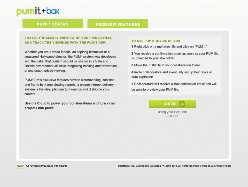
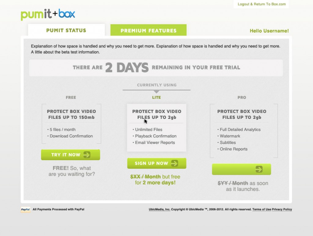
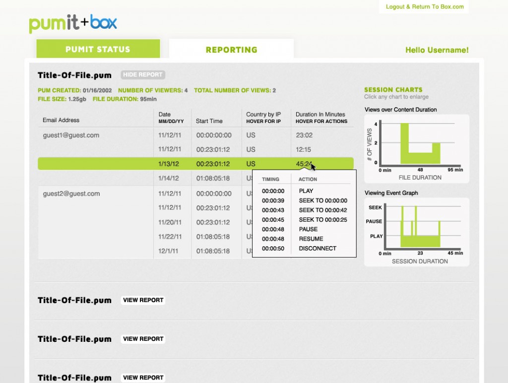
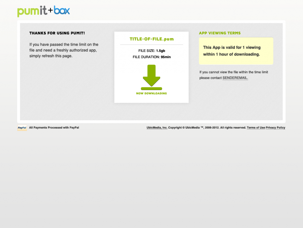
Phase 1. Integration with Box.com
Ubic was rushing to get to market with an extension for the Box.com platform. They had a logo and basic design guidelines, but nothing set in terms of how to explain their product or how to use it. In this phase I concentrated on choosing clear use workflows and consistent language with users.
Phase 2. Landing page for marketing
As work on the Box.com integration wound down I moved into taking the established language and visual style into the broader marketing of the product. This involved in-depth work with the technical and sales team to create a series of icons (and icon sets) that would appeal to a creative audience and simplify the complicated nature of PUMit. These icons became a visual system that would be used across any new features that were developed and newly developed internal and external marketing tools.
I spent time working to establish a simple and useful vocabulary around the product. Ubic was a French company, and had a difficult time with the brevity necessary for marketing. Simplifying their initial language into sizes appropriate for the audience was a large part of the project.
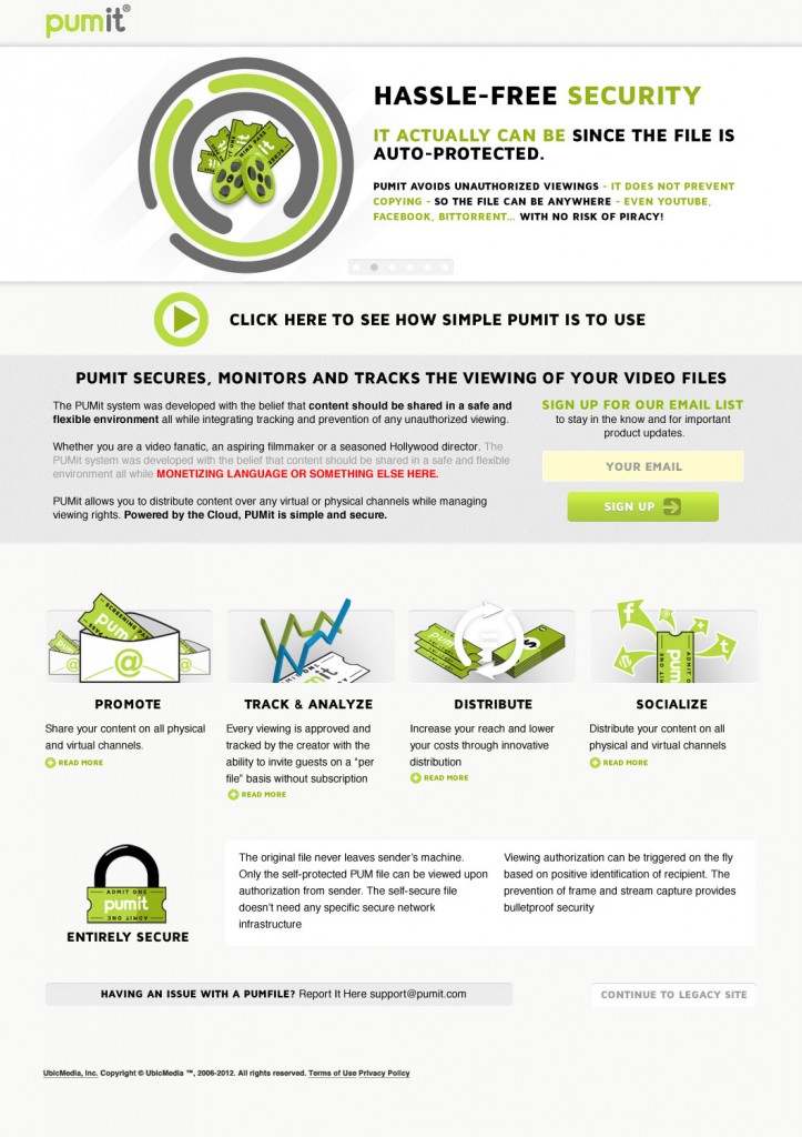
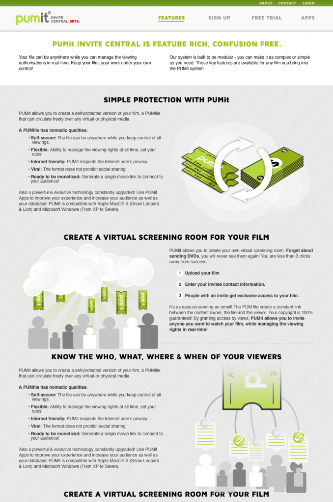
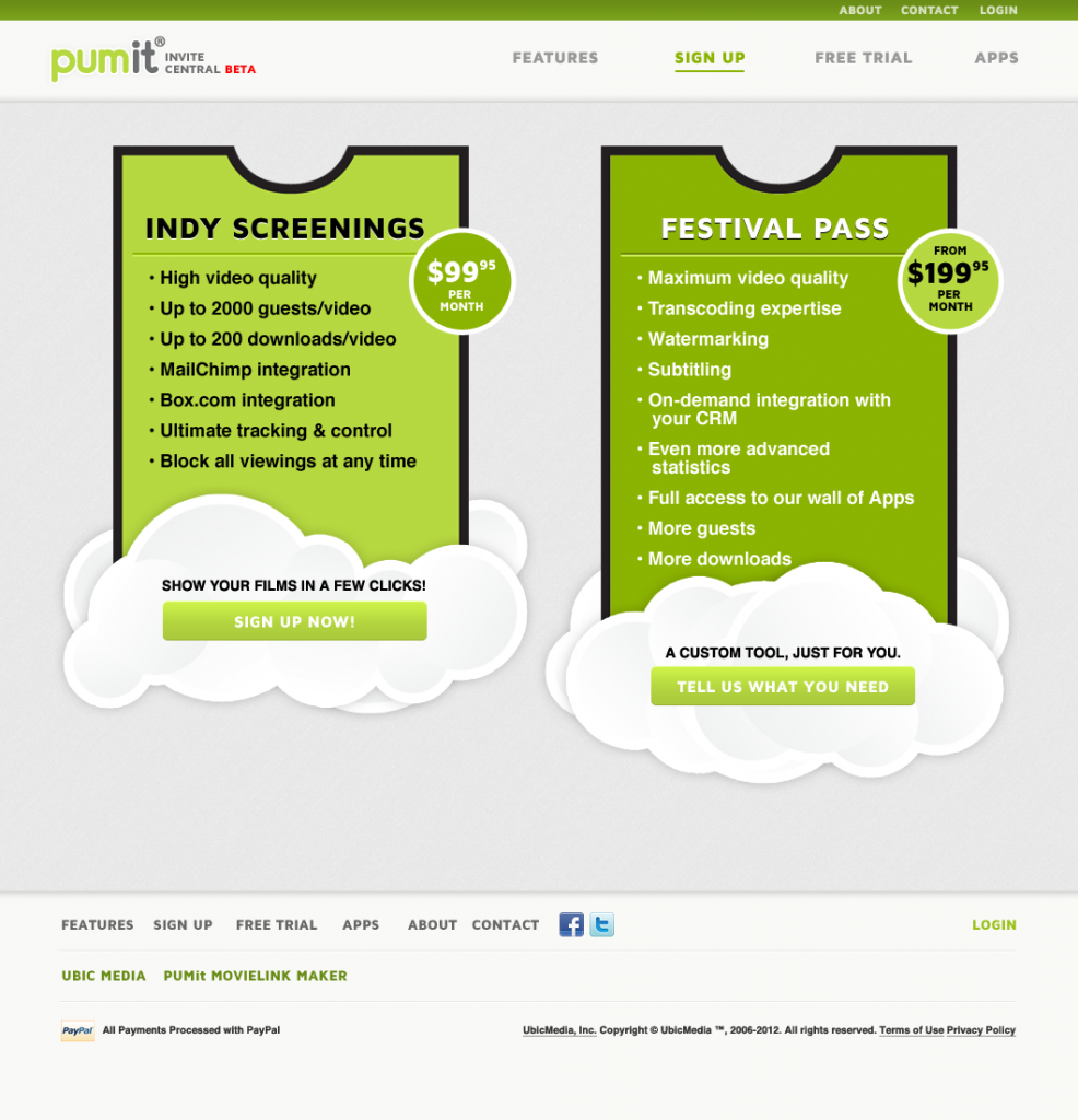
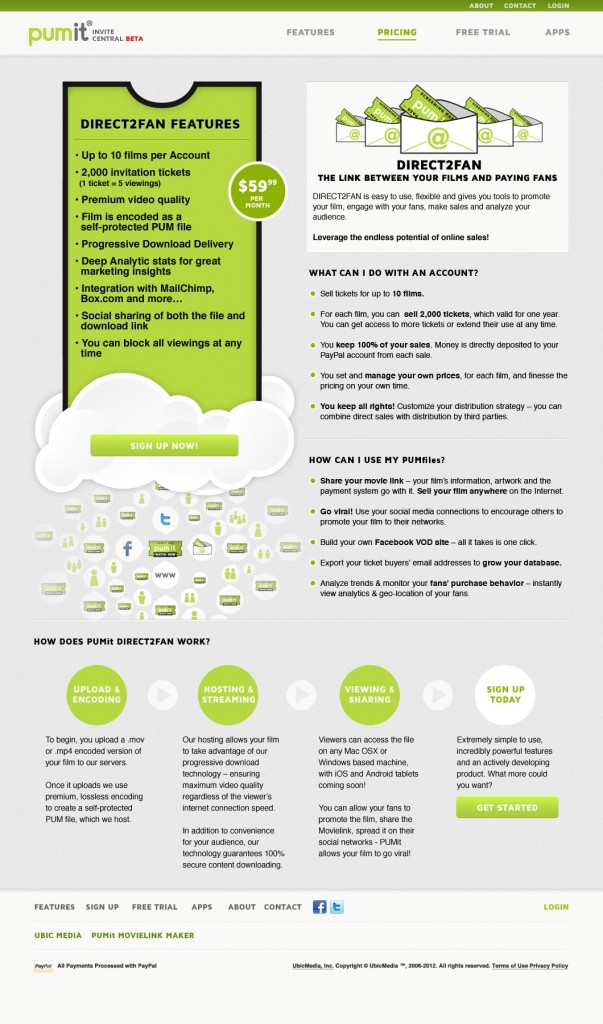
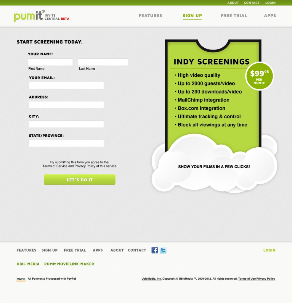
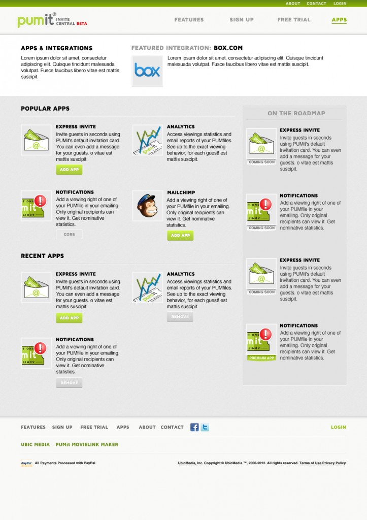
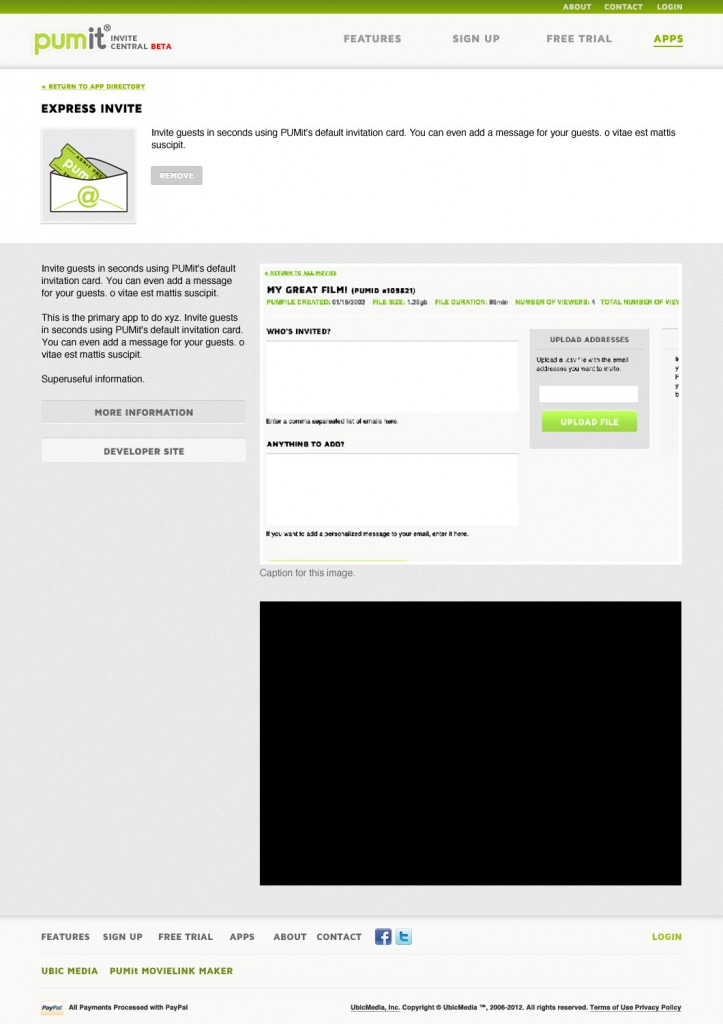
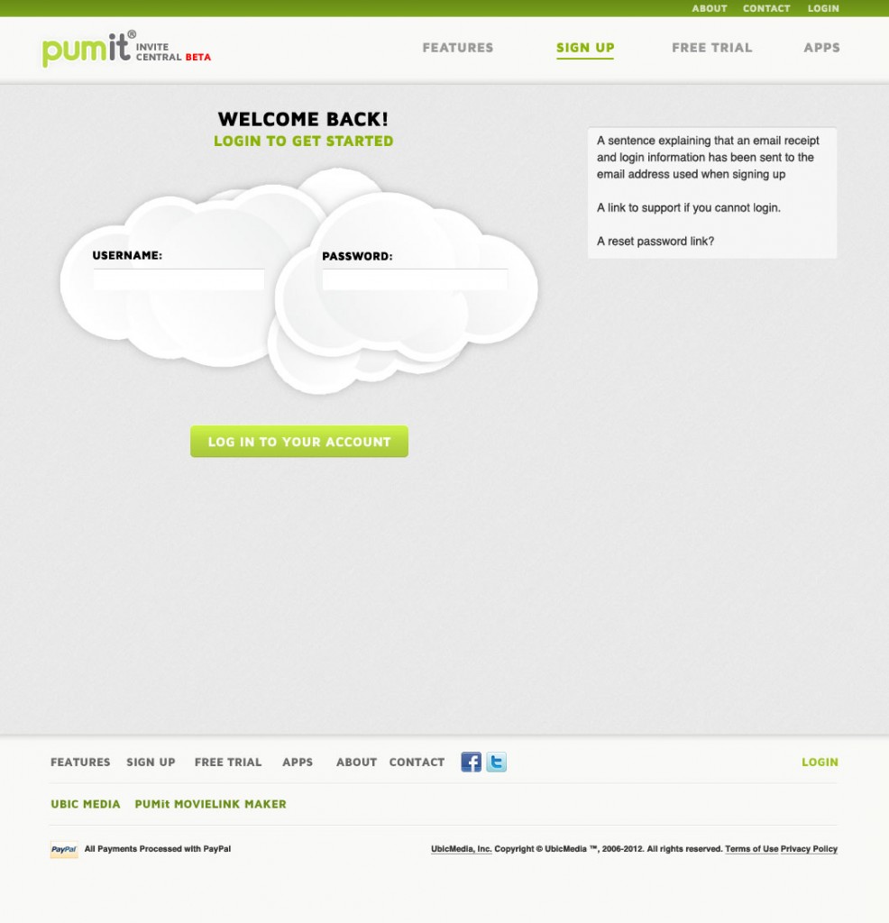
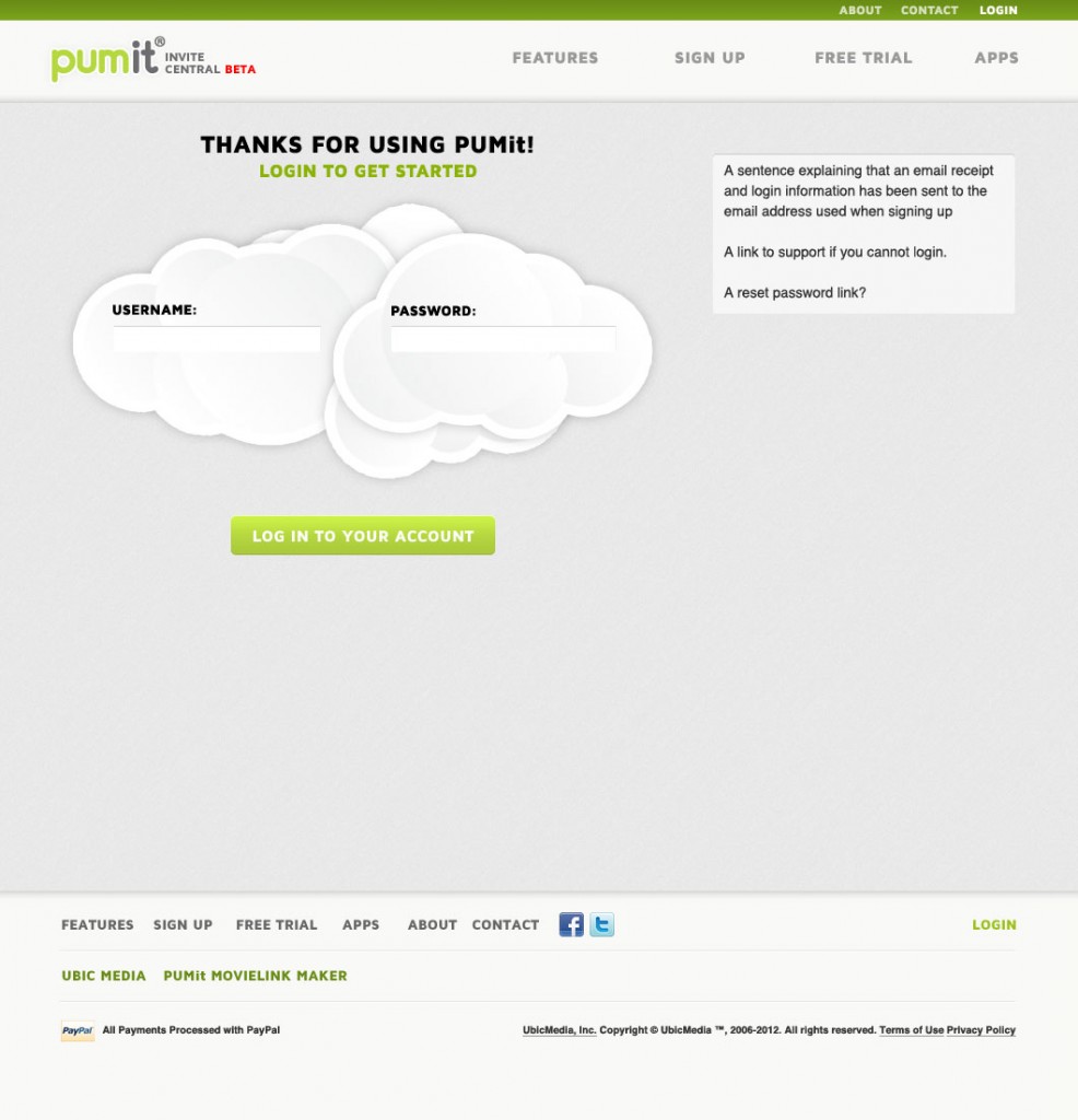
Establishing clear methods of representing cloud functionality, security and the basic business model of the tool helped streamline the internal discussions at Ubic and allowed them to begin the process of educating their users about more complicated features within the platform.
Phase 3. App design
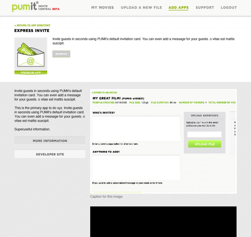
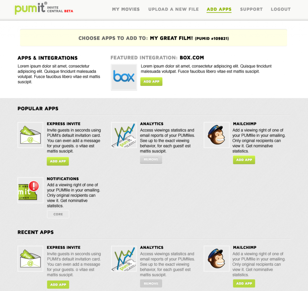
Once we had an established voice for the product and a set visual language, Ubic had honed down their business plans enough to build up their apps. Their internal process required me to be more reactive than guiding, but I was able to generate a set workflow for users adding and maintaining their content on the PUMit site. As mentioned above, I focused on clarity and consistency for the users – with direct simple language at any state change, and consistent treatment of any notifications.
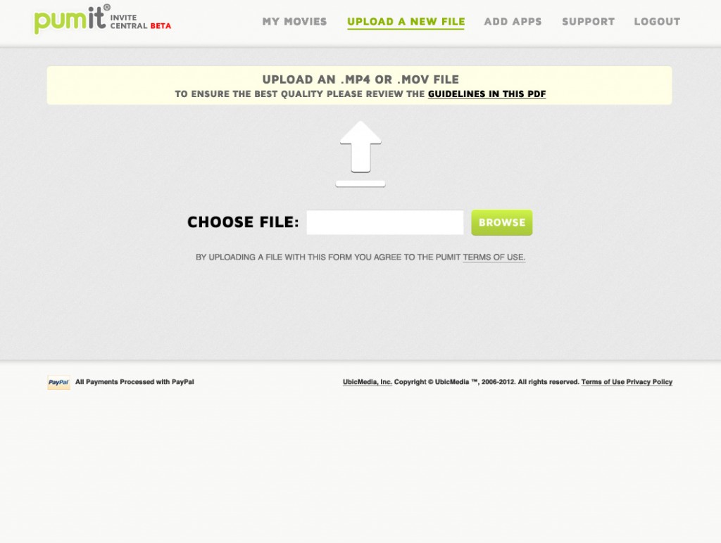
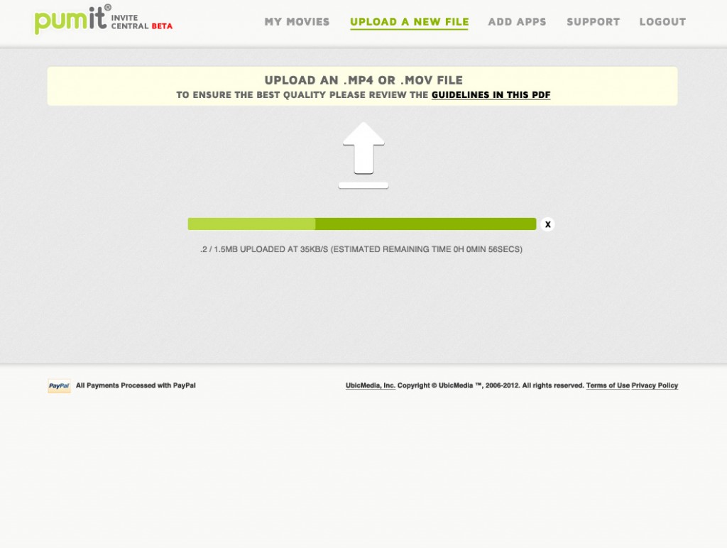
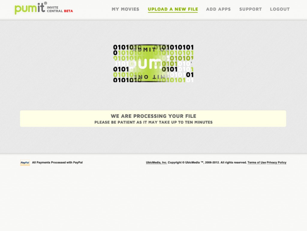
PUMit was an ambitious project for Ubic to undertake. I learned a good deal about the importance of setting guidelines for style, interaction and language while core functionality is being coded up and finalized. Creating a product, and then trying to bring the interface and experience to bear on it is a recipe for long hours and frustration. We arrived at a great place with this application, but it certainly took longer than anyone anticipated.